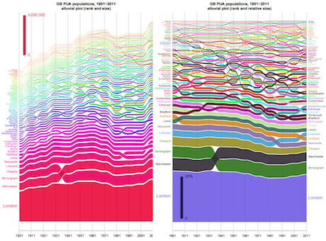
Alluvial diagrams were first proposed to represent changes in network structure over time. Robin Edwards from CASA has implemented the tool and has several examples from social and political arrays which he shows in his blog GeoTheory. Rosvall and Bergstrom’s popularisation of the technique in their paper Mapping Change in Large Networks was published in PLoS ONE, volume 5, in 2010. The technique goes back a long way to many visualizations of flow systems where the flows change in size with respect to one another over time, and the so-called Sankey diagram is a variant of this to represent branching flows widely employed in energy studies.
Here we show how the technique can be used to show how a system of cities where each city which is located in a different location, changes with respect to its size over time. What we do is rank the cities from the largest to the smallest plotting the biggest city by its size on the vertical axis at the first time period, the second by its size above the first and so on accumulating the sizes until the entire population of cities has been plotted. If we do this at the next time period, some of these cities will have changed in rank and most likely they will have all changed in size. If the whole population of these cities gets larger, the graph will increase in terms of its accumulated population. Otherwise it will reduce. So in a sense it is like a layer cake with the largest city at the bottom and the smallest at the top. The first diagram on the left above is this plot, while the second on the right is the same but normalised with respect to relative – proportionate – change.
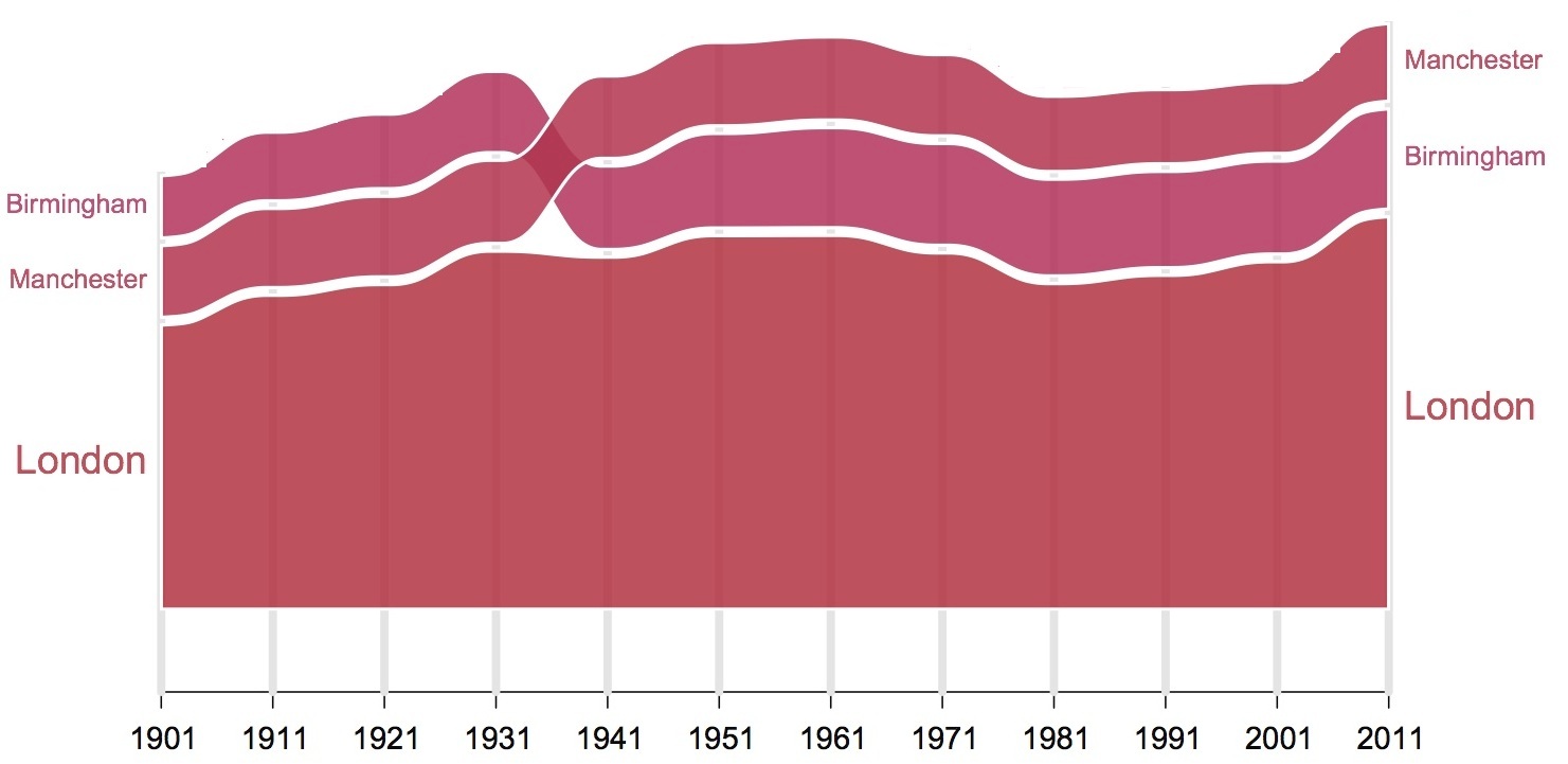
However what makes this tool so interesting is that the rank of these cities may change. If the largest city at the first time period becomes the next largest at the next time period, its position on the graph will change, and in this way we will see the cities changing in rank as well as size through time. In our UK data set of cities as primary urban areas, if we consider the largest city in the urban system which is London, this remains the top rank over the last 100 years but Manchester is the second until 1941 when Birmingham takes over. We show this section of the graph which is the bottom three streams of the graph shown above as follows.
What we do to make the diagram flow, is present these city sizes as temporal streams whose width is city size. These streams of course can overlap between time periods and this represents changes in rank. We also separate every stream from each other by thin white band and this makes it easier to read the flow graph. We call these graphs ‘alluvial’ because they bear a resemblance to alluvial fans that result from deposits in streaming water.
In fact we can use this technique to examine any m x n table which represents quantities that vary continuously over their m and n dimensions. These quantities may be discrete – that is, the continuum of the dimension may be divided into discrete values but as long as one of the dimensions flows in terms of the way its variable changes, we can use this to represent the stream. If both flow, we can plot the alluvial diagram in either direction and this makes the tool quite generic. In fact we use it here to visualize changes in city size through time. As we show illustrate it, it is probably as good if not better than the rank-clock that I introduced some 8 years ago (Batty, 2006) where one simply plotted the rank, not the size, as a traceline or trajectory around a clock where the clock goes from the start time t at midnight/noon around to the last time t+T at the next midnight/noon.
There are many embellishments we can make to this system. Robin Edwards produced this plot using R scripting and he is currently producing a very interesting online interface that can accept any m x n matrix of quantities and visualize them in the form shown above. One can manipulate the plot in terms of the way it is illustrated – the top rank can be at the bottom with the bottom rank at the top and vice versa. One can start at any time period and colour the streams differently and so on. When it is ready I will post another comment on how you can get access to the program which will be through a web page.

